UI Components
Terminology
All of the following terms are important to know, they'll be used often both by Discord's internals and by fellow developers as you start engage with the community. The first three are generally used terms for web development. After that, they are either Discord-specific or BetterDiscord-specific.
Modal
Modals are elements that overlay the main screen in the center, usually darkening the rest of the page behind them. These are often used to get user input or display important information.
Example
Popout
Popouts are similar to modals in that they overlay the main screen, however they almost never darken the page behind them, nor are they front-and-center. These usually stick near the user's mouse location and appear after a user input. They are great for displaying additional information to the user about something specific.
Example
Tooltip
Tooltips are yet another overlay element. These are very similar to popouts but much much smaller and usually point to a specific element to indicate that it is giving additional information about it. This is used to make clean buttons or clarify text.
Example

Notice
Notices are a Discord-specific term for a banner-like element that appears at the top of the screen. In Discord this is most often used to either give persistent information or passively wait for user interaction.
Example

Toast
Toasts are a BetterDiscord-specific term for a small tooltip-like popup that appears at the bottom of the screen. This is borrowed from the Android ecosystem and was modeled after it. Toasts are used to indicate information to the user about either interaction or background tasks.
Example

BdApi Helpers
NOTE
This section is still being updated for the BetterDiscord v1.11.0 update!
There are some utility functions from BdApi that help you build and display certain UI elements. Using them instead of building your own saves you code and helps ensure a consistent UI/UX for the end user across plugins. While they may work for a large range of cases, for advanced UIs (and ones not handled in BdApi) you will need to build your own.
alert
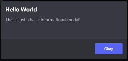
The BdApi.UI.alert() method allows you to create and display a simple yet extensible informational modal. Its signature is alert(title, content).
The most straightforward way to use it, is to just use strings.
BdApi.UI.alert("Hello World", "This is just a basic informational modal!");Result
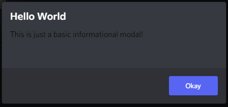
You can also pass in a react element for content but not for title. However, this means you are on your own for functionality and styling. In the last example we saw that the content text was colored and themed properly. But let's try just wrapping a string in a react element.
BdApi.UI.alert("Hello World", <div>This is just a basic informational modal!</div>);Result
And since we are able to use react here for content, it also allows us to pass in a whole tree of elements or custom components. This allows for some very interesting alert possibilities.
function MySearchInput(props) {
return <input
type="text"
placeholder={props.placeholder || "Search..."}
onChange={props?.onChange}
/>;
}
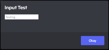
BdApi.UI.alert(
"Input Test",
<MySearchInput
placeholder="Testing..."
onChange={event => console.log(event)}
/>
);Result
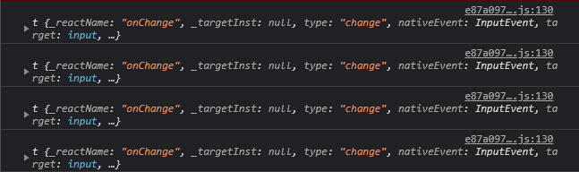
Console
Important to note for later that alert returns a unique modal ID used internally by Discord. We won't be going over its usage here--it's safe to ignore--but may be covered by advanced guides.
buildSettingItem & buildSettingsPanel
This are covered in the previous guide in the section going over how to build a settings menu!
createTooltip
If you're not using React, this little utility can come in handy. If you give it an HTML element to follow, a label, and an optional set of options, this will generate a return a nifty little tooltip.
// This tooltip will automatically show/hide as the user hovers myElement
const tooltip = BdApi.UI.createTooltip(myElement, "My label", {side: "bottom"});

// But, we can also forcibly show (or hide) the tooltip to fit our needs
tooltip.show()
The default options object for createTooltip looks something like this:
{
    "style": "primary",
    "side": "top",
    "preventFlip": false,
    "disabled": true
}
The sides available are top, right, bottom, and left.
The styles available are primary, info, success, warn, and danger.
You can also directly access the elements of the tooltip afterwards. So if you need to update the label you can do something like this:
tooltip.labelElement.textContent = "New label";

// Or even fancier
const myNewLabel = BdApi.DOM.parseHTML(`<div class="foo">New label text</div>`);
tooltip.labelElement.textContent = "";
tooltip.labelElement.append(myNewLabel);
The options with this tooltip are surprisingly wide, so your best bet is to play around with it in console and get a feel for it.
showChangelogModal
When you want to show the user that you've added some cool features or fixed some nasty bugs, this function can help you show it in a clean and consistent way.
BdApi.UI.showChangelogModal({
    title: "My Plugin",
    subtitle: `version ${version}`,
    blurb: "A summary of this update",
    changes: [
        {
            title: "New Features",
            type: "added",
            blurb: "Summary of the new features",
            items: [
                "Added feature A!",
                "Refactored feature B into feature C!"
            ]
        },
        {
            title: "Bugs Eliminated",
            type: "fixed",
            items: [
                "No more corrupt settings.",
                "Clicking the button does stuff."
            ]
        }
    ]
});
You can check the api reference for more details, but this little snippet shows the most important features. Notably, this changelog api can also allow you to display a banner image, a youtube video, or a direct video above all of the text. This can be useful when you need to add a showcase of new things or if you just want to have a consistent branding. There are also 4 change "types". In the snippet we see fixed and added, there are also improved and progress.
For now, plugins will have to decide when to display the changelog modal, though it is planned to be more automated in a future BetterDiscord update. For an example of how to do this check out this Demo Plugin featuring the new APIs for BetterDiscord v1.11.0.
showConfirmationModal
Under the covers, alert makes use of showConfirmationModal. This one is an even more extensible and useful helper function. Similar to alert this has a title and content parameter that accept the same types as before. It's full signature is showConfirmationModal(title, content, options = {}). For a full list of options check the api reference. We'll be going over some of the more useful ones here.
BdApi.UI.showConfirmationModal("Hello World", "This is just a basic confirmation modal!");Result
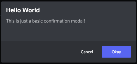
Looking at the result of this one, we can see there is an additional "cancel" button. We can change the text of both of those buttons as well as respond to either of them being clicked using the options in this example.
function MySearchInput(props) {
    return <input
                type="text"
                placeholder={props.placeholder || "Search..."}
                onChange={props?.onChange}
            />;
}

BdApi.UI.showConfirmationModal(
    "Input Test",
    <MySearchInput
        placeholder="Find..."
        onChange={event => console.log(event)}
    />,
    {
        confirmText: "Search",
        cancelText: "Nevermind",
        onConfirm: () => console.log("Pressed 'Search'"),
        onCancel: () => console.log("Pressed 'Nevermind' or escape")
    }
);
Result
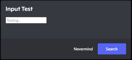
Here clicking Search will close the modal and call the onConfirm function we passed. Similarly clicking Nevermind will call onCancel. If the user exits the modal either by pressing escape on their keyboard or by clicking outside of the modal on the dark background, onCancel will also be called in this case.
Much like alert the function returns a unique modal ID.
showToast
Since toasts are meant to be simple and straightforward messages to the user, making and showing a toast is just the same. The signature is showNotice(content, options = {}). But unlike with the modals, content can only be a string. And it's safe to ignore the options and still successfully show a fully styled toast. We'll go over the useful ones here, but be sure to check the api reference for a full listing of options.
BdApi.UI.showToast("This is just a basic toast!");Result

The most important and frequently used option is type. This allows a full styling of different toasts complete with icons for different situations. This is defaulted to an empty string, resulting in the image above. The other options are shown below:
Info

Success

Warning

Error

The toasts, much like on Android, disappear after a set time. By default, this is in 3 seconds. You can change this using the timeout option which takes a number of milliseconds to show the toast before it disappears. This function does not return anything.
showNotice
This function has the same signature as showToast with the except that content can also be an HTMLElement. This allows it to be a bit more customizable. However, most of the functionality you would need is included already.
BdApi.UI.showNotice("This is just a basic informational notice!");Result

They can do more than just show information though, you can also add multiple buttons for the user to interact with.
BdApi.UI.showNotice(
    "This is just a basic informational notice!",
    {
        type: "error",
        buttons: [
            {
                label: "Click Me!",
                onClick: () => console.log("Clicked Me")
            },
            {
                label: "No Me!",
                onClick: () => console.log("Wrong One!")
            }
        ]
    }
);
Result

Notice how this time we used type: "error" and it became red. This has the same type and styling options as showToast.
Each of the buttons here act completely independently which allows for powerful combinations. Additionally, you can have the notice close after a set time using timeout. This is a number of milliseconds after which to close the notice. If set to 0 (the default), it won't close until closed by the user or the caller.
showNotice returns a function which allows the original caller to close the notice either earlier than the timeout or without user interaction. The onClick of the button is provided with this same function as the only argument.